Skip to content
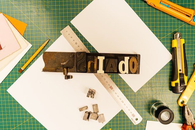
In the ever-evolving world of design, typography stands as a dynamic cornerstone, transcending mere words to communicate emotions, ideas, and identity. As we delve into the captivating realm of typography trends, we embark on a journey to explore the innovative fonts and layouts that are reshaping the visual language of contemporary design. From the mesmerizing dance of fonts to the artful arrangement of text, join us as we unveil the techniques and insights that are revolutionizing the typographic landscape.
Typography, once relegated to functional significance, has metamorphosed into an art form that breathes life into digital and print media alike. In an age where first impressions matter more than ever, understanding typography trends is paramount. Typography not only guides the reader’s eye but also elicits emotions and responses. Through deliberate font choices and layout designs, designers wield the power to shape user experience and create memorable interactions.
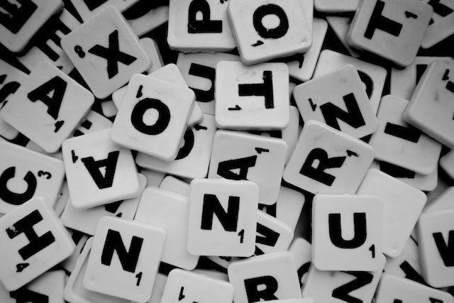
Exploring Font Types: From Serifs to Sans-Serifs
Typography is a rich tapestry woven from various font types, each with its distinct personality and historical context. Fonts are more than just aesthetic choices; they influence how content is perceived and received. In this section, we embark on a journey through the diverse landscape of font types, shedding light on the characteristics and nuances that define them.
Serif Fonts: Timeless Elegance and Tradition
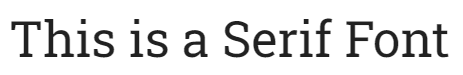
Serif fonts are known for their timeless elegance and classical appeal. Characterized by the small “feet” or decorative extensions at the end of letter strokes, serifs evoke a sense of tradition and authority. This type of font is often associated with formal documents and printed literature, exuding a sense of reliability and trustworthiness. Serif fonts are particularly suited for body text in print materials, offering comfortable reading experiences.
Some of the most commonly used serif fonts include Times New Roman, Garamond, Baskerville, Georgia, and Courier New.
Sans-Serif Fonts: Modern Simplicity and Clarity
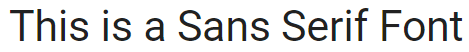
On the other end of the spectrum, sans-serif fonts exude modernity and simplicity. Free from the decorative flourishes of serifs, these fonts boast clean lines and a straightforward aesthetic. Sans-serif fonts are versatile and legible even at smaller sizes, making them an excellent choice for digital interfaces and screens. Their minimalist charm is often used to convey a sense of contemporary sophistication and directness.
Some of the most popular sans serif fonts on the black include Arial, Helvetica, Proxima Nova, Futura, and Calibri.
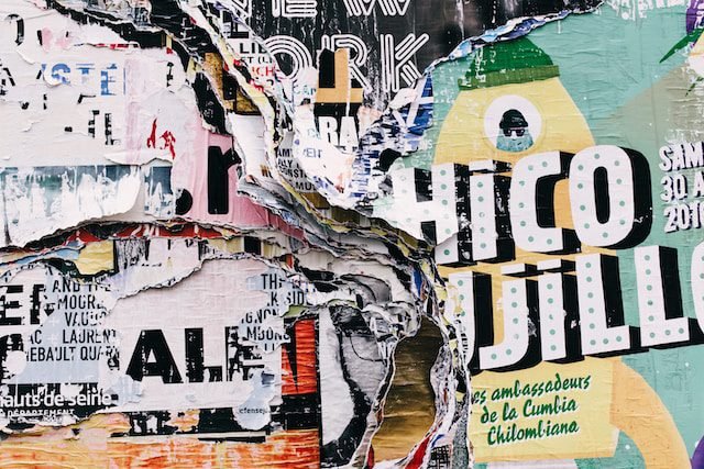
Display Fonts: Making a Bold Statement
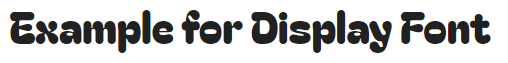
Display fonts are the extroverts of the typographic world, designed to command attention and make bold statements. These fonts come in various shapes and styles, ranging from elegant scripts to quirky and decorative typefaces. Display fonts are ideal for headlines, titles, and logos, adding a touch of flair and personality to a design. While they might not be suitable for extended reading due to their elaborate nature, they excel at capturing the viewer’s gaze and setting the tone for the content.
Script Fonts: Elegant Flourishes and Handwritten Charm
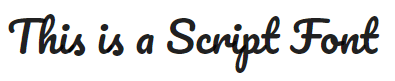
Script fonts emulate the beauty of handwritten calligraphy, with their fluid lines and elegant curves. These fonts evoke a sense of sophistication and personal touch, often used to add a touch of elegance to invitations, branding materials, and creative projects. While script fonts offer a distinct charm, they require careful handling to ensure readability, especially in longer passages of text.
Modern Fonts: Embracing the Contemporary
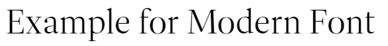
Modern fonts emerged as a departure from traditional styles, characterized by high contrast between thick and thin strokes and minimalistic design elements. These fonts often exude a sense of luxury and fashion-forwardness, making them a popular choice for high-end brands and editorial design. Modern fonts combine historical influences with a contemporary twist, resulting in a balance between tradition and innovation.
Popular modern fonts include Bodoni, Helvetica, Avenir, and Futura.
Understanding the nuances of font types empowers designers to select the right typography to convey the intended message and aesthetics. Whether evoking timeless elegance, embracing modern simplicity, or making a bold statement, the choice of font type plays a pivotal role in shaping the visual language and impact of a design.
Font Choices
Minimalistic Elegance: The Rise of Thin and Ultra-Light Fonts
Simplicity became one of the most appealing interactions in a society overwhelmed with visual information. Thin and ultra-light fonts have emerged as beacons of simplicity, capturing attention through their understated beauty. These delicate fonts exude sophistication and modernity, making a statement with subtlety, and embracing the less-is-more philosophy. Their thin strokes create a harmonious balance, allowing content to breathe while delivering a message that is both impactful and refined. As users navigate through a sea of content, these fonts create a serene and inviting space, guiding the reader’s eye with finesse.
For a deeper exploration of minimalism, refer to our related post: The Art of Minimalism in Graphic Design: Crafting Impact Through Simplicity.
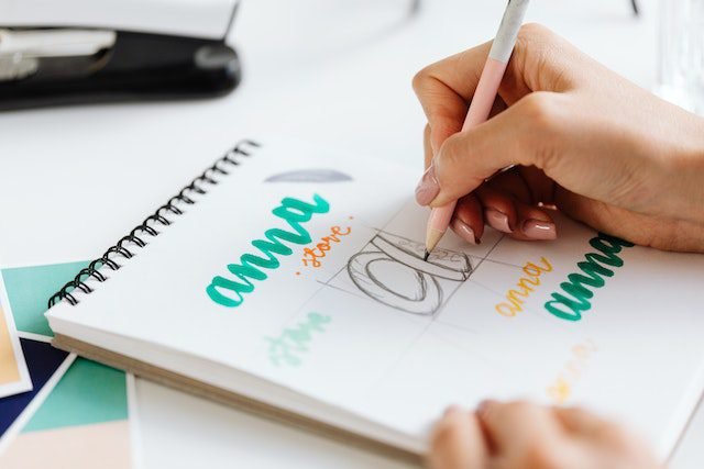
Quirky and Playful: Embracing Unique and Handwritten Fonts
As authenticity and individuality gain prominence, designers are turning to unique and handwritten fonts to infuse personality into their work. These fonts inject a sense of human touch and playfulness, capturing the essence of imperfection in a digital world. By embracing unique handwritten fonts, designers infuse their creations with character and whimsy. The irregularities and idiosyncrasies of these fonts evoke a sense of warmth and relatability, forging a deeper connection between the content and the reader. This trend celebrates individuality and beckons audiences to explore beyond the ordinary.
Moreover, these types of fonts create feelings of nostalgia, reminiscent of personal notes and messages penned by hand. Each curve and stroke tell a story, making every piece of content feel like a personal conversation. The juxtaposition of these fonts against modern design elements creates a visual tension that draws the eye and encourages engagement.
Futuristic and Bold: Exploring Geometric and Sci-Fi Inspired Fonts
The future has always been a source of fascination, and it comes as no surprise that typography trends are embracing the boldness of the unknown. Geometric and sci-fi-inspired fonts are making waves with their futuristic aesthetics. Angular and precise, these fonts evoke a sense of technological advancement and cutting-edge innovation. Their geometric shapes and sharp angles create a visual language that speaks to the possibilities of tomorrow. As designers explore these fonts, they transport audiences into a realm where the unimaginable becomes tangible, inviting them to embark on a journey through typography that is truly out of this world.
As we navigate the intricate landscape of innovative font choices, we witness the transformative power of typography. Each font selection is a deliberate brushstroke on the canvas of design, contributing to a narrative that resonates with audiences on a visual and emotional level. From the delicate whispers of minimalistic elegance to the spirited dance of quirky handwritten fonts and the bold proclamation of futuristic typefaces, typography emerges as a vessel of creative expression that knows no bounds.
Cutting-Edge Layout Designs
Asymmetry and Broken Grids: Embracing Controlled Chaos
The conventional grid has undergone a transformation, making room for the avant-garde allure of asymmetry and broken layouts. By deliberately disrupting the grid, designers create controlled chaos that demands attention and exploration. Asymmetry challenges norms, inviting audiences to engage with unexpected juxtapositions and visual surprises. This technique allows for a dynamic and memorable reading experience that defies predictability.
Microinteractions with Typography: Engaging User-Focused Design
Incorporating typography into microinteractions elevates user-focused design to new heights. Dynamic typography responds to user actions, creating an immersive and interactive experience. Whether it is a hover effect that reveals hidden text or a scrolling animation that unveils a message, microinteractions forge a personal connection between the user and the content. This approach transforms typography from a static element into a powerful storytelling tool that unfolds with each interaction.
The Art of Overlapping: Layering Text for Depth and Interest
Text overlap adds a layer of depth and visual intrigue to layouts, allowing for creative storytelling that transcends traditional design boundaries. By carefully layering text elements, designers craft a multidimensional experience that captivates the viewer’s gaze. Overlapping text with images or other design elements creates a sense of harmony and unity, guiding the eye through a carefully curated narrative that stimulates curiosity and engagement.
Color and Typography Fusion
Additionally to the overlapping of text with design elements, the fusion of color and typography emerges. Just as colors evoke emotions and set the mood, typography shapes the way we engage with content. When these two elements converge, a new dimension of creativity unfurls, offering designers a canvas on which to paint rich narratives and captivating experiences. In this section, we delve into the captivating world of color and typography fusion, exploring how the interplay between hues and letterforms creates a dynamic and resonant visual language.
For a deeper dive into the world of color theory, refer to our related post: Mastering Color Theory: A Comprehensive Guide for Beginner Graphic Designers.
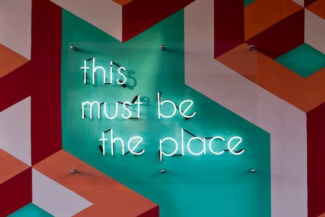
High Contrast Pairings: Enhancing Readability and Impact
The fusion of color and typography unleashes a realm of creative possibilities, none more impactful than high-contrast pairings. Vibrant colors juxtaposed with legible text create a visual dynamic that demands attention. This technique amplifies the message, ensuring that content is not only visually appealing but also easily digestible. The interplay between bold hues and crisp fonts results in an engaging and unforgettable visual experience.
Monochromatic Magic: Subtle Typography in a Single Hue
Monochromatic color schemes, when merged with typography, wield a unique kind of magic. By using various shades of a single hue, designers create a harmonious and subtle backdrop for typography to shine. This technique evokes a sense of sophistication and simplicity, allowing text to take center stage while maintaining an air of elegance. Monochromatic typography is an artful dance of contrast and harmony, captivating audiences with its understated allure.
Responsive Typography
Responsive design has become a crucial factor in our increasingly linked society, as screens come in a variety of sizes and devices range from the palm of our hands to large desktop monitors. Within the realm of design, one aspect that demands particular attention is responsive typography. Just as a design layout must adapt to different screen sizes, so too must the typography seamlessly adjust to provide optimal readability and aesthetic appeal.
Fluid Typography: Adapting Fonts to Diverse Screen Sizes
Responsive typography is not a one-size-fits-all solution, but rather a dynamic approach that ensures legibility and visual harmony across a range of devices. Fluid typography is the backbone of this adaptation, enabling fonts to flex and adjust proportionally in response to the screen’s dimensions. As the screen size changes, so do the font size and spacing, ensuring that the text remains comfortably readable without overwhelming or underserving the user.
Imagine a website viewed on a smartphone screen. The text should adjust to fit the narrow display without sacrificing readability. Similarly, when viewed on a large desktop monitor, the typography should expand to utilize the available space effectively. Fluid typography achieves this delicate balance, providing a consistent and optimal reading experience across devices.
Variable Fonts: A Revolution in Responsive Typography
The emergence of variable fonts marks a significant evolution in responsive typography. Unlike traditional fonts with fixed attributes, variable fonts allow for real-time adjustments of various parameters, such as weight, width, slant, and even optical size. This unprecedented level of flexibility offers designers unparalleled control over how fonts respond to different screen sizes and devices.
With variable fonts, designers can create a single font file that encompasses a spectrum of styles. This means that a font can seamlessly transition from being bold and eye-catching on a large desktop screen to more delicate and subtle on a mobile device, all while maintaining the core identity of the typeface. This adaptability not only enhances readability but also contributes to a more cohesive and visually pleasing user experience.
Imagine a news website that needs to present headlines prominently on both desktop and mobile screens. With a variable font, the headlines can automatically adjust to suit the available space, optimizing legibility and impact without manual intervention.
Responsive typography, powered by fluidity and variable fonts, exemplifies the dynamic nature of modern design. It acknowledges the diversity of devices through which users access content and ensures that typography remains a powerful and accessible tool for effective communication. As designers embrace the principles of responsive typography, they empower their designs to transcend physical boundaries, engaging audiences regardless of the screen they use.
Cultural and Artistic Influences
Typography Inspired by Nature: Organic and Eco-Friendly Fonts
In a world increasingly conscious of environmental issues, typography is embracing nature-inspired designs. Organic and eco-friendly fonts draw inspiration from the natural world, evoking a sense of tranquility and sustainability. These fonts often incorporate flowing lines, leafy motifs, and earthy textures, creating a harmonious connection between design and nature. By infusing eco-consciousness into typography, designers contribute to a visual narrative that reflects a deeper appreciation for the planet.
Retro Revival: Nostalgic Typography for a Contemporary Audience
Nostalgia holds a powerful allure, and designers are tapping into this sentiment by resurrecting retro typography. Vintage fonts evoke a sense of nostalgia for bygone eras, invoking a warm familiarity that resonates with audiences. By modernizing classic typefaces, designers bridge the gap between the past and present, capturing the essence of a different time while catering to contemporary aesthetics. The marriage of nostalgia and innovation results in designs that feel both timeless and fresh.
The Psychology of Typography
Emotional Resonance: How Fonts Evoke Feelings and Reactions
Typography is not about aesthetics; it is a vehicle for emotion. Different fonts can elicit a wide range of feelings and reactions, from warmth and comfort to excitement and urgency. Serif fonts, with their elegant curves, often convey tradition and reliability, while sans-serif fonts exude modernity and minimalism. Display fonts command attention and boldness, while script fonts evoke a sense of elegance and sophistication. By understanding the psychological impact of fonts, designers can harness typography to create emotional connections that leave an impression.
Building Brand Identity: Typography as a Key Branding Element
In the competitive world of branding, every element matters, and typography plays a pivotal role in shaping a brand’s identity. The choice of font can convey a brand’s personality, values, and ethos. Whether it is a luxury brand opting for an elegant serif font or a tech company embracing a sleek and futuristic sans-serif, typography becomes a visual shorthand for the brand’s essence. Consistency in font usage across various touchpoints reinforces brand recognition and fosters a sense of trust and loyalty among consumers.
Tools and Resources for Typography Exploration
Typography Software and Tools for Designers
For designers seeking to embark on typographic adventures, a plethora of software and tools await. Leading design software such as Adobe Creative Suite and Sketch offer robust typographic capabilities, allowing designers to experiment with fonts, sizes, and alignments. Online typography generators and font pairing tools simplify the process of finding the perfect combination, while type specimen books provide a tactile experience for exploring and comparing fonts. With these tools at hand, designers can unleash their creativity and embark on innovative typographic journeys.
Online Communities and Courses: Nurturing Typography Enthusiasts
Typography enthusiasts thrive in communities that foster knowledge exchange and growth. Online forums, social media groups, and design-focused platforms provide spaces for designers to share their typographic experiments, seek feedback, and learn from peers. Additionally, numerous online courses and tutorials delve deep into the art and science of typography, offering insights into font selection, layout techniques, and typographic principles. By immersing themselves in these communities and courses, designers can tap into a wealth of collective expertise, honing their typographic skills and pushing creative boundaries.
Conclusion: Embracing the Typography Renaissance
As we traverse the diverse and captivating landscape of typography trends, one truth becomes evident: We stand on the brink of a typography renaissance. The fusion of innovative fonts, boundary-pushing layouts, and the psychology of typefaces has paved the way for a new era of visual communication. From minimalistic elegance to the bold frontiers of sci-fi fonts, from nostalgic revivals to nature-inspired designs, typography holds the key to unlocking endless creative possibilities.
In the ever-evolving realm of design, typography stands as a powerful catalyst for innovation and expression. As designers continue to explore new fonts, layouts, and typographic techniques, the boundaries of visual communication expand, giving rise to a renaissance that pushes the art of typography into uncharted territories. With a world of creative potential at their fingertips, designers are poised to reshape the way we perceive and interact with the written word, leaving an indelible mark on the canvas of design history.
FAQs: Navigating the Typographic Terrain
1. How do I choose the right font for my design project?
Start by considering the message and emotions you want to convey. Match the font’s style with the project’s tone – elegant, playful, bold, etc. Ensure readability by testing the font at different sizes.
2. What is the importance of responsive typography in web design?
Responsive typography ensures that text remains readable and visually appealing across various screen sizes and devices. It maintains a consistent user experience and prevents content from becoming illegible.
3. How can I combine fonts effectively in my design?
Focus on contrast and complementarity. Pair a bold headline font with a clean, readable body font. Consider font families or type classifications to maintain visual harmony.
4. What are variable fonts, and how can I use them?
Variable fonts are typefaces with adjustable attributes, offering flexibility in weight, width, and more. They allow for dynamic typography customization and improved web performance.
5. How can I create a strong brand identity using typography?
Consistency is key. Choose fonts that align with your brand’s personality and values. Ensure that your chosen typography is used consistently across all brand touchpoints.