Skip to content
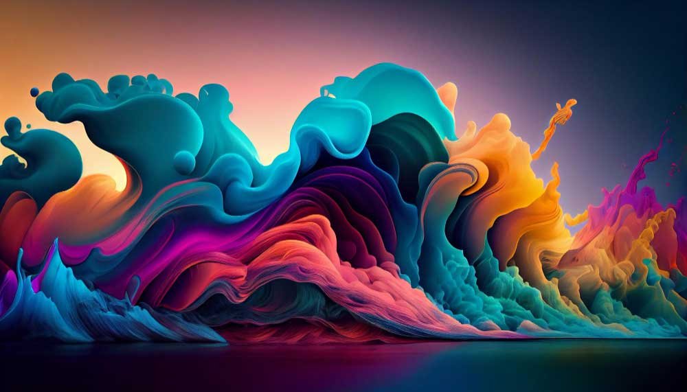
Color is more than a visual element; it is a language of emotions and a conduit of communication. As a beginner graphic designer, understanding color theory is your passport to creating impactful and visually stunning designs. In this guide, we will dive deep into the world of color theory, equipping you with the knowledge and skills to wield colors with confidence and purpose.
The Basics of Color Theory
Before we embark on our journey through color theory, let us lay a solid foundation. Colors are not passive entities; they hold the power to evoke feelings, tell stories, and establish connections. Beyond their visual appeal, colors stir emotions and convey messages that resonate with your audience. By grasping this fundamental truth, you will be better prepared to harness the potential of color in your designs.
To understand it better, the heart of color theory lies in the color wheel, a visual representation of primary colors – red, blue, and yellow. These primaries blend to create secondary colors like green, orange, and purple. Through further mixing, tertiary colors emerge, forming a vibrant spectrum. Understanding this arrangement allows designers to navigate the color wheel, unlocking the potential for creative combinations.

The Color Wheel: Navigating the Spectrum
Imagine a tool that simplifies the complexities of color relationships – that tool is the color wheel. Positioned at the intersection of art and science, the color wheel is your guide to understanding the spectrum of colors. It organizes colors in a logical sequence, from primary to secondary to tertiary hues. As you navigate this wheel, you will gain insights into how colors relate and interact, enabling you to make informed choices in your designs.
Color Harmony: Creating Visual Balance
Harmony is the sweet spot where colors blend seamlessly, creating a visual symphony that resonates with viewers. In color theory, harmony is the art of balancing colors in a way that engages the eye, evokes specific feelings, and guides the viewer’s journey through your design. As a graphic designer, mastering color harmony is a transformative step toward crafting visually captivating and emotionally resonant compositions.
The Dance of Complementary Colors
At the heart of color harmony lies the dance of complementary colors. Imagine a color wheel where each hue has a partner opposite it – these are complementary colors. When placed side by side, complementary colors create a dynamic contrast that draws attention and creates visual energy. Think of red and green, blue and orange, or purple and yellow. These pairs possess an inherent tension that, when used judiciously, adds vibrancy and drama to your designs.
Analogous Harmony: A Subtle Serenade
Analogous color harmonies offer a more delicate and harmonious approach. In this scheme, colors adjacent to each other on the color wheel are chosen. This results in a smoother transition, creating a sense of unity and cohesion. Analogous harmonies are often found in nature – think of the gentle gradient of colors in a sunset. They provide a serene and pleasing visual experience, making them ideal for conveying tranquility and subtlety in your designs.
Triadic Brilliance: Balancing Diversity and Unity
Triadic color harmonies are the virtuosos of color relationships. Picture an equilateral triangle on the color wheel, connecting three equally spaced hues. This harmony strikes a remarkable balance between diversity and unity, offering a rich and dynamic palette. By leveraging triadic harmonies, you infuse your designs with visual interest without overwhelming the viewer. The key lies in selecting a dominant color and using the other two to enhance and complement it.
Tonal Harmony: Gradations of Elegance
Another valuable technique is tonal harmony. This approach involves selecting a single color and using its various shades and tints to create a seamless progression. Tonal harmonies can be monochromatic – focusing on the variations of a single color – or they can involve closely related hues. This harmony creates depth and dimension, guiding the eye through a range of intensities while maintaining a sense of unity.
Achieving Harmony: Guiding Principles
As you explore these different forms of color harmony, remember that balance is key. Consider the emotional tone you want to convey – whether it is the bold excitement of complementary colors, the serene grace of analogous harmonies, or the dynamic equilibrium of triadic schemes. Pay attention to contrast and proportion; a harmonious design engages through the interplay of light and dark, warm, and cool.
The Psychology of Colors: Conveying Emotions
Colors are more than just visual stimuli; they evoke emotions and memories. The psychology of colors is a fascinating realm where the shades you choose convey messages and stir feelings in your audience. Warm colors like red and orange radiate energy and passion, while cool hues like blue and green evoke calmness and tranquility. Moreover, colors are laden with cultural and emotional associations. Red can symbolize both love and danger, while yellow might denote happiness or caution. The cultural significance of colors further emphasizes their role in effective communication and design. By understanding the emotional impact of colors, you will be able to create palettes that resonate with your design’s intent and connect with your target audience.
Color in Branding: Establishing Identity
Branding is more than a logo; it is a symphony of colors that forms a distinct identity. Think of McDonald’s golden arches or Coca-Cola’s iconic red – these colors are embedded in our cultural consciousness. Your color choices are a potent tool for shaping brand perception and recognition. When used strategically, they convey values, evoke emotions, and create a lasting imprint on the minds of consumers. By mastering the art of color in branding, you will create designs that not only look appealing but also communicate a brand’s essence.
The Palette of Perception
Colors are a universal language that transcends words and speaks directly to our emotions and perceptions. When you see a red logo, do you feel a rush of excitement? Or does a calm blue palette invoke a sense of trust and reliability? These associations are not arbitrary; they are the result of years of psychological conditioning and cultural influences. By selecting colors strategically, brands can tap into this reservoir of perceptions to shape how they are perceived by the world.
Color Psychology: Crafting Emotional Narratives
Color psychology is a realm where science meets art. It is the study of how colors affect human behavior and emotion. For instance, warm colors like red and orange can stimulate appetite and enthusiasm, making them popular choices for food and entertainment brands. In contrast, cool tones like blue and green exude calmness and serenity, fitting for wellness and environmental initiatives. By understanding the emotional nuances of colors, you can weave narratives that resonate deeply with your target audience.
The Role of Consistency
Imagine encountering a brand with a different color scheme every time you interact with it. The lack of consistency would be disorienting and dilute the brand’s impact. Consistency is the cornerstone of effective branding. Establishing a cohesive color palette across all touchpoints – from logos to packaging to marketing materials – creates a unified and memorable visual identity. This visual consistency fosters brand recognition and builds trust over time.
Cultural Considerations: A Global Language
In some cultures, a color may symbolize luck and prosperity, while in others, it may carry negative connotations. As a graphic designer, it is crucial to be mindful of these cultural nuances when working on international branding projects. Adapting your color choices to resonate with local perceptions demonstrates respect for diverse audiences and ensures your designs communicate effectively across borders.
Navigating the Branding Spectrum
Branding is not a one-size-fits-all endeavor; it spans a spectrum of personalities and attributes. A youthful, energetic brand may opt for vibrant and playful colors, while a luxury brand may choose sophisticated and muted tones. The key lies in aligning color choices with brand values, target demographics, and desired emotional responses. By crafting a tailored color palette, you infuse life into brand narratives and create an identity that stands out in a sea of competitors.
Crafting Brand Experiences
Effective branding is about more than a logo or a color scheme; it is about crafting holistic brand experiences. Colors extend beyond visual elements to evoke sensory and emotional responses. Imagine stepping into a retail store bathed in warm, inviting hues – the colors contribute to the overall ambiance and influence your perception of the brand. From packaging design to store interiors, each touchpoint is an opportunity to create immersive brand experiences through color.
Color in Typography and Layout
Colors go beyond images; they dance through typography and layout, influencing how readers engage with your content. Typography is not about fonts; it is about readability and communication. When you harmonize colors in your typography and layout, you guide the viewer’s eye, highlight key information, and create a hierarchy of importance. Colors become a language that enhances comprehension and adds an aesthetic dimension to your design. In this section, we will explore how to strike that delicate balance between aesthetics and functionality.
Color in Digital Design: User Experience Enhancement
In the digital realm, colors are dynamic players that shape user experiences. Imagine a website where colors guide users through navigation, call attention to interactive elements, and create a cohesive visual narrative. The art of color in digital design is not about aesthetics; it is about user experience. By understanding color psychology and the principles of user-centered design, you will craft digital interfaces that are not only visually appealing but also intuitive and engaging.

The Language of Visual Hierarchy
Colors wield the power to guide users through digital landscapes with finesse. A well-executed color hierarchy directs attention, highlights crucial elements, and simplifies navigation. Imagine a call-to-action button in a bold, contrasting color – it draws the eye and encourages action. Conversely, subdued colors can signify secondary information. By mastering the art of visual hierarchy, you ensure users interact with your design in a purposeful and intuitive manner.
Emotional Engagement: Setting the Mood
Moreover, colors are conduits of emotion, and in digital design, they set the mood for user interactions. A tranquil blue backdrop can induce a sense of calmness, while a vibrant red might evoke excitement. The choice of colors can influence how users feel and behave within a digital space. By aligning color choices with the desired emotional responses, you create an immersive experience that resonates with users on a subconscious level.
Accessibility and Inclusivity
Digital design is inclusive design, and color plays a pivotal role in ensuring accessibility for all users, including those with visual impairments. Consider the legibility of text against background colors – a high contrast ratio enhances readability. Additionally, avoid relying solely on color to convey information; use text labels or symbols to ensure comprehension. By designing with accessibility in mind, you create a user experience that caters to diverse needs.
Feedback and Interaction
In addition to accessibility, colors are dynamic agents that provide feedback and signal interactions. When a button changes color upon being clicked, users receive instant confirmation of their action. Subtle color changes can signify hover states, guiding users to interactive elements. By leveraging color for feedback, you enhance user confidence and create a responsive and engaging interface.
Consistency Across Platforms
In an era of multi-device usage, maintaining color consistency across platforms is paramount. A color that evokes trust on a website should evoke the same feeling on a mobile app. Consistency fosters brand recognition and ensures that users have a seamless experience regardless of the device they are using. By adhering to a unified color palette, you build a bridge of familiarity that connects users to your brand’s digital presence.
Evoking Action: Call to Conversion
Lastly, colors have the remarkable ability to influence user behavior, and nowhere is this more evident than in conversion-driven design. The strategic use of color in calls-to-action (CTAs) can significantly impact conversion rates. A well-placed, contrasting CTA button can prompt users to sign up, make a purchase, or engage with content. By understanding the psychology of color in conversion, you transform design elements into catalysts for user action.
Color in Print Design: From Screen to Paper
Translating digital designs to print requires finesse and a solid grasp of color modes and profiles. Colors behave differently on screens and paper, and maintaining consistency across mediums is a challenge. In this section, we will delve into the intricacies of color in print design. We will explore color modes like CMYK and RGB, delve into color profiles, and equip you with the knowledge to ensure your designs look just as stunning on paper as they do on screen.

Color Modes
In order to master the color modes, you need to understand what it means. Color modes are the languages through which digital and print media communicate. In the digital world, RGB (Red, Green, Blue) is the primary color mode, blending light to create a spectrum of colors. However, the printing process operates on a different principle – CMYK (Cyan, Magenta, Yellow, Black) color mode. This distinction underscores the need for translating digital designs into a format that can be faithfully replicated on paper. Converting RGB colors to their CMYK counterparts is a vital step in achieving color accuracy in print.
Navigating Color Profiles
Along with the color modes there are color profiles. Color profiles add another layer of complexity to the print design equation. They define how colors are interpreted and reproduced, ensuring consistency across devices and printing processes. A mismatched color profile can lead to color shifts and inaccuracies. Calibrating your design software and understanding different color profiles – such as sRGB for digital displays and ICC profiles for print – is essential for maintaining fidelity from screen to paper.
Achieving Consistency and Color Calibration
Consistency is the heartbeat of effective print design, unlike color modes and profiles. Calibrating your monitor to display colors accurately and using color calibration tools can bridge the gap between on-screen design and printed output. Printing a test copy or proof allows you to verify that the colors you see on screen translate faithfully onto paper. By investing in the meticulous process of color calibration, you ensure that your designs achieve the intended impact in the tangible world.
The Challenge of Color Reproduction
The printing process introduces its own set of challenges to color reproduction. Factors like paper type, ink absorption, and printing technology can influence how colors appear on the final product. Additionally, light conditions under which the print is viewed can impact perceived colors. To overcome these challenges, collaborate closely with print professionals, select appropriate paper stocks, and perform color tests to achieve accurate and vibrant color reproduction.
Print as a Tangible Experience
Print design offers a tactile and sensory experience that digital media cannot replicate. The texture of paper, the weight of a business card, or the finish of a brochure – all these elements contribute to the overall perception of your design. The choice of paper and finishes, such as glossy or matte, can alter how colors are perceived and interact with light. By understanding the interplay between color and physical materials, you can design for a multisensory impact.
The Journey of Transformation
The transition from screen to paper is a transformative journey, where colors take on new life and dimensions. Embrace this journey as an opportunity to enhance your design’s visual richness and tactile allure. By mastering the intricacies of color modes, profiles, consistency, and print challenges, you ensure that your designs seamlessly traverse the digital divide, making their mark on the tangible world with the same brilliance and impact.
Practical Exercises: Applying Color Theory
Theory comes alive through practice. It is not enough to know about color theory; you must apply it to truly grasp its nuances. This hands-on section is your playground for experimentation. From creating mood boards that evoke specific emotions to designing mock projects that highlight your newfound color prowess, these practical exercises will transform theory into a tangible skill. As you immerse yourself in these activities, you will develop an intuitive sense of color that guides your creative choices.

Creating Mood Boards: Evoke Emotions Through Colors
Mood boards are your artistic playground for exploring the emotional impact of colors. Start by selecting a theme – it could be “serenity,” “energy,” or “playfulness.” Then curate a collection of images, textures, and color swatches that encapsulate that emotion. Use software or physical collages to arrange your selections. As you arrange colors side by side, observe how they interact and amplify the desired mood. This exercise enriches your sensitivity to color relationships and trains your eye to see beyond individual hues.
Designing Monochromatic Compositions: Delve into Depth
Monochromatic designs, built around a single color, are exercises in subtlety and depth. Choose a base color and explore its various shades, tints, and tones. Create a design (it could be a poster, a logo, or a digital illustration) using these variations of a single hue. This exercise hones your ability to create visual interest using variations of intensity rather than relying on a wide spectrum of colors. It is a lesson in nuance and balance that enhances your color composition skills.
Exploring Color Harmony in Photography: Real-World Application
Another way to sharpen and master color harmony is by observing real-world applications. Take your camera or smartphone and embark on a color-hunting expedition. Choose a specific color harmony (complementary, analogous, or triadic) and seek out real-world examples that embody this harmony. Capture scenes, objects, or moments that highlight the chosen color relationship. As you immerse yourself in this exercise, you will develop a keen eye for spotting color harmonies in the world around you. This skill will be invaluable in translating theory into practical design choices.

Designing a Mock Project: Applying Theory to Context
Now comes the challenge of how to apply it to the designs. First, Consider the emotions you want to evoke, the brand’s identity, and the message you aim to convey. Apply color theory principles to craft a design that aligns with the project’s purpose and target audience. Experiment with different color harmonies, typographic choices, and layout compositions. This exercise bridges theory and real-world application, allowing you to witness the transformation of concepts into compelling visuals.
Color Swatch Exploration: Experimentation and Discovery
Another way to apply the color theories is to gather a diverse range of color swatches – whether physical Swatch books or digital color libraries. Set aside time for exploration and experimentation. Create small compositions or patterns using different color combinations. Do not hesitate to mix unexpected hues; this is your opportunity to push boundaries and challenge your preconceptions about color. This exercise sparks creativity helps you break away from color comfort zones and encourages innovative design solutions.
Crafting with a Palette of Creativity
Your journey through color theory has equipped you with a treasure trove of insights and skills. You have unlocked the power of color relationships, harmonies, psychology, and practical application. Armed with this knowledge, you stand at the threshold of design possibilities. As you embark on your creative endeavors, remember that colors are your allies – your tools to captivate, communicate, and leave an indelible mark on the canvas of design.
Experiment with unexpected color juxtapositions, challenge conventional norms, and let your intuition guide you in crafting designs that provoke emotions, stimulate curiosity, and leave an indelible mark on the viewer’s mind. With your newfound understanding of color theory, you have the artistic license to paint the canvas of your imagination with a vibrant spectrum of possibilities, elevating your creations to a realm where colors transcend mere visuals and become the very essence of your artistic expression.
FAQs: Demystifying Color Theory
By demystifying color theory and addressing common questions, we aim to provide you with a comprehensive understanding of this essential aspect of graphic design. Remember, color theory is not just a skill; it is a journey of exploration and expression that will elevate your design work to new heights.
1. Can I use any colors together in my designs?
While you have creative freedom, certain color combinations work better together than others. Understanding color harmonies can guide you in creating visually pleasing and balanced designs.
2. How do I choose colors that align with a brand’s identity?
Consider the brand’s values, target audience, and the emotions it wants to evoke. Colors associated with these factors can form the foundation of your color palette.
3. What’s the best way to ensure consistent colors in print and digital designs?
Convert your digital designs to the appropriate color mode (CMYK for print, RGB for digital) and use color profiles to maintain consistency across mediums.
4. How can I enhance user experience using color in web design?
Use color to guide users, differentiate interactive elements, and create a visually coherent interface. Consider color psychology to evoke desired emotions and actions.
5. Are there specific tools to help me choose and experiment with color palettes?
Yes, there are various online tools and color palette generators that can assist you in selecting and exploring color combinations for your designs.