Step into a world where symbols hold the key to brand identity, and where a single image can stir emotions, trigger memories, and weave stories. In this dynamic design aspect, a logo transcends its role as a mere visual element, morphing into a powerful emblem that embodies the very essence of a brand. It stands as a testament to the art and science of capturing the intangible and translating it into a tangible mark.
A well-crafted logo, like a masterful stroke of a brush on canvas, goes beyond aesthetics; it encapsulates the heart and soul of a brand’s narrative. It is a meticulously concocted blend of colors, shapes, typography, and symbolism that works in harmony to convey messages both overt and subtle. Much like a hypnotic melody that resonates in the mind long after it is heard, a logo imprints itself on the consciousness of consumers, forging a connection that defies geographical borders and transcends cultural barriers.
Understanding the Impact of Colors and Shapes
The Color Palette: Unveiling the Subconscious Associations
Color, as the language of emotions, holds the remarkable ability to evoke specific feelings, associations, and even memories. Just as a single hue can transport us to a moment in time, brands strategically employ colors to communicate messages that resonate deeply with their target audience. The human brain’s response to colors is rooted in a complex interplay of biology, psychology, and culture, shaping the perceptions and attitudes consumers have toward a brand.
When exploring the psychology of color in logo design, delving into the nuances of color theory becomes paramount. Colors trigger both conscious and subconscious reactions, influencing how individuals perceive and engage with a brand. Warm tones like red and orange ignite feelings of passion and energy, creating a sense of urgency that is masterfully employed by brands like Coca-Cola. On the other hand, cooler hues such as blue and green evoke a sense of calm and reliability, often harnessed by financial institutions to foster trust and stability.
To gain mastery over color theory and its intricate impact on logo design, delve into our dedicated post on “Mastering Color Theory: A Comprehensive Guide for Beginner Graphic Designers.” This comprehensive resource will equip you with a deeper understanding of color psychology, enabling you to wield the full spectrum of hues to craft logos that resonate powerfully with your brand’s intended message.
Shapes Speak Louder Than Words: Geometric Psychology
Shapes, much like colors, carry subconscious meanings that influence our perceptions. Circles convey Beyond the realm of color; the very shape of a logo carries profound implications. Geometric shapes, simple in form, possess an innate ability to evoke emotions and convey messages with remarkable precision. Every curve, angle, and line within a shape resonates with the viewer’s subconscious, triggering associations that influence their perception of the brand.
Consider the power of circles, universally recognized as symbols of unity and wholeness. Brands like Target leverage the circle’s friendly and inclusive nature to create an approachable and welcoming identity. Conversely, angular shapes such as triangles and squares evoke a sense of stability and order. Brands like Microsoft employ squares to communicate reliability and structure, aligning with their technological offerings.
The interplay between shapes and emotions is a fascinating realm within logo design, a realm that speaks volumes without uttering a single word. By harnessing the psychological impact of shapes, designers wield the ability to sculpt brand identities that resonate deeply and intuitively with audiences.

Typography and Brand Identity
Crafting Letters: The Art of Typeface Selection
Typography, often referred to as the voice of design, is a cornerstone of brand identity. The choice of typeface carries immense weight, as it not only conveys the brand’s personality but also influences how the audience perceives and connects with the message. Just as different accents alter the way we interpret spoken language, distinct typefaces infuse written words with unique nuances and emotional tones.
The selection of a typeface is a deliberate act that demands an understanding of the brand’s essence and target audience. A bold, modern sans-serif font may encapsulate innovation and cutting-edge values, while a classic serif font can evoke a sense of tradition and timelessness. For instance, the New York Times logo employs a distinctive serif typeface, mirroring its reputation for delivering authoritative and timeless news.
Typography goes beyond mere aesthetics; it forges a connection between the brand and its audience, nurturing familiarity, and resonance. The right typeface becomes a vessel through which brand messages are communicated, each curve and stroke an intentional brushstroke that paints a vivid picture of the brand’s identity.
Readability vs. Aesthetics: Striking the Right Balance
The pursuit of the perfect typeface demands a delicate equilibrium between readability and aesthetics. While ornate scripts may appear visually captivating, their intricate design might compromise legibility, hindering effective communication. Striking this balance ensures that the logo not only captivates the eye but also conveys its intended message with clarity.
Consider the FedEx logo as a testament to this equilibrium. Within its simple typeface lies a hidden arrow, a subtle nod to the brand’s focus on speed and precision. The choice of font, with its clean lines and sans-serif structure, enables the logo to effectively deliver its message while retaining an element of intrigue. Typography serves as the bridge between language and design, a bridge that carries not only words but emotions, values, and stories.
For a deeper dive into the evolving world of typography trends and how they intersect with brand identity, explore our comprehensive post on “Typography Trends: Embracing Innovation in Fonts and Layouts.“

Symbolism and Storytelling through Icons
Unveiling the Symbolism: Icons in Logo Design
Icons distill a brand’s story into a single image, transcending language barriers. Those compact yet potent visual elements hold the unparalleled ability to encapsulate an entire narrative within a single image. Much like ancient hieroglyphics that conveyed stories of civilizations past, icons in logo design distill a brand’s essence, values, and aspirations into a concise and unforgettable representation.
The power of icons lies in their universal language. These visual symbols transcend linguistic barriers, allowing brands to communicate with audiences across diverse cultures and languages. Take the Apple logo, for instance—an image of an apple with a missing bite. This iconic emblem is more than a mere fruit; it is an embodiment of knowledge, curiosity, and the allure of discovery. With its roots in the story of Isaac Newton reading under an apple tree, the apple serves as a potent symbol that resonates on both conscious and subconscious levels. In other words, the discovery of new things.
Minimalism vs. Detail: Conveying Messages with Precision
The eternal debate between minimalism and intricate detail rages on. Minimalist logos capture the essence with minimal elements. The Twitter bird, a simplified yet recognizable silhouette, embodies simplicity, making it instantly shareable and memorable.
On the other side of the spectrum, detailed icons weave intricate narratives. Brands like Starbucks harness the power of detail to tell stories of seafaring romance and global exploration through their siren emblem. Every sinuous line and intricate detail invites exploration, drawing the viewer into a world of rich history and boundless possibilities.
The art of selecting between minimalism and detail is a delicate dance, where each element holds the potential to shape perception and evoke emotions. By understanding the psychology behind these choices, designers can craft icons that resonate harmoniously with their brand’s identity. which will be discussed later in the article.
Cultural Influences on Logo Perception
Local vs. Global: Navigating Cultural Sensitivities
In the intricate tapestry of logo design, culture weaves threads of significance that can impact how a logo is perceived. Cultural contexts, traditions, and values exert a profound influence, shaping the lens through which logos are interpreted. As brands transcend geographical boundaries and venture into global markets, the challenge lies in crafting logos that resonate universally while remaining sensitive to diverse cultural nuances.
Colors, for instance, hold varying meanings across cultures. While white signifies purity and innocence in Western societies, it symbolizes mourning in many Asian cultures. A logo adorned with white may evoke conflicting emotions, illustrating the need for cultural awareness. Navigating this terrain requires a delicate balance, ensuring that the logo conveys its intended message without inadvertently offending or alienating specific audiences.
Universal Symbols: Tapping into Shared Cultural Icons
On the other hand, in cultural diversity, certain symbols transcend borders, becoming beacons of shared understanding. These universal symbols possess the remarkable ability to evoke emotions and create connections that resonate globally. Think of the heart symbol—universally recognized as an emblem of love and compassion. Brands like Airbnb harness such symbols to communicate inclusivity and belonging, fostering an emotional connection with travelers from diverse backgrounds. This interplay between local and global sensibilities presents both challenges and opportunities.
The Subtle Art of Emotion Elicitation
Eliciting Emotional Responses: The Subconscious Impact
In the grand symphony of logo design, emotions play a captivating melody that resonates deeply within the hearts and minds of consumers. Logos possess a remarkable ability to evoke emotional responses, cultivating an intangible yet powerful bond between brands and their audience. The journey of emotions begins with the very first glimpse of a logo, as it engages the subconscious, triggering feelings that influence perceptions, decisions, and brand loyalty.
Consider the Disney logo—a magical gateway to enchantment and nostalgia. With its whimsical lettering and iconic castle, it conjures feelings of joy, wonder, and a connection to cherished childhood memories. This emotional resonance not only captures attention but also establishes a profound relationship between the brand and its patrons.
Analyzing Emotional Logo Designs
The intricate dance of emotion elicitation is the hallmark of exceptional logo design, where every curve, color, and element are orchestrated to harmonize with human psychology. As designers, understanding the emotional spectrum and harnessing it within a logo is akin to capturing lightning in a bottle—a fusion of artistic ingenuity and psychological insight.
Real-world examples offer a vivid illustration of the art of emotion elicitation in logo design as described. The Airbnb logo, known as the “Bélo,” stands as a testament to the power of emotional storytelling. The symbol embodies the concept of belonging, represented by a heart nestled within the iconic “A.” This design choice fosters an emotional connection with travelers, encouraging them to embrace new destinations while instilling a sense of community and shared experiences.
Another intriguing logo is the WWF (World Wildlife Fund) logo. The stylized image of a panda, perfectly nestled within the negative space of the initials, invokes a sense of empathy and concern for endangered species. This iconic emblem masterfully channels compassion and urgency, compelling viewers to take action for the betterment of our planet.

The Role of Simplicity in Brand Recall
The Power of Simplicity: Less is More in Logo Design
In the complex tapestry of logo design, simplicity emerges as a guiding principle that wields an astonishing impact. A simple logo possesses a timeless allure, a magnetic quality that draws the gaze and etches itself into memory. The adage “less is more” is particularly apt in the realm of logo design, where the restraint of minimalism often leads to the creation of iconic emblems that transcend trends and become timeless classics.
Consider the Nike swoosh—an embodiment of simplicity that has become synonymous with athleticism, performance, and the spirit of triumph. Its clean lines and unadorned form communicate a sense of movement and momentum, capturing the essence of the brand in a single, uncluttered stroke.
Versatility vs. Complexity: Striking a Balance
In the intricate dance of logo design, the dichotomy between versatility and complexity presents a captivating challenge. Striking the right balance between these two elements is akin to crafting a harmonious melody—a symphony of visual elements that resonate across a spectrum of applications and contexts.
While simplicity is a hallmark of effective logo design, the challenge lies in achieving it without sacrificing the essence of the brand. The process of simplification requires careful consideration of each element, ensuring that the logo remains versatile across diverse applications, from business cards to billboards and digital interfaces.
The allure of a simple logo lies not only in its aesthetic appeal but also in its ability to stand the test of time. Simplicity defies the whims of passing trends, allowing logos to remain relevant and resonant for generations. Over time, the logo becomes a symbol of familiarity, triggering instant recognition and cultivating a sense of trust among consumers.
The Apple logo offers a prime example of striking the perfect balance between simplicity and detail. A sleek, minimalist silhouette of an apple with a missing bite reflects the brand’s focus on innovation and user-friendly design. This iconic emblem effortlessly adapts to a variety of contexts, retaining its potency whether emblazoned on a product, projected on a screen, or etched on the back of a device.
On the other hand, consider the intricately detailed Starbucks siren—an emblem that tells a story of maritime history and exploration. The balance achieved here is masterful: every swirl, every strand of hair, and every subtle detail contributes to the brand’s narrative without overwhelming the viewer. The logo retains its allure and intricate beauty while remaining recognizable even when scaled down to fit a tiny cup.
Maintaining this equilibrium demands meticulous consideration of every design element. It is about distilling complexity into essential components, ensuring that each intricate detail serves a purpose and contributes to the logo’s visual impact. As logos expand beyond their traditional applications into the digital realm and beyond, this balance becomes even more crucial, enabling logos to adapt to responsive designs, app icons, social media avatars, and more.
Evolution and Adaptation of Logos
From Past to Present: Tracing the Evolution of Iconic Logos
The journey of a logo is a testament to the dynamic nature of branding. Like a living entity, logos evolve over time, responding to shifts in design trends, societal changes, and the brand’s own evolution. Tracing the path of iconic logos unveils a narrative of transformation, innovation, and strategic adaptation.
For example, the evolution of the Pepsi logo—a case study in navigating the currents of design aesthetics. Over the decades, the Pepsi logo has undergone several transformations, each reflecting the prevailing design sensibilities of its era. From its initial intricate script and heraldic crest to its modern, simplified globe design, the Pepsi logo has morphed to reflect changing tastes while preserving its brand essence. This evolution is a poignant reminder of a brand’s willingness to embrace change, ensuring continued relevance in a rapidly evolving world.
Modernization vs. Tradition: When and How to Revamp a Logo
The decision to update the logo is a delicate balance between preserving tradition and embracing modernity. As brands venture into new territories, cater to new demographics, or pivot their focus, a logo revamp can serve as a powerful statement of growth and adaptability. However, the process requires careful consideration to avoid alienating loyal customers or diluting the brand’s identity.
A prime example of a successful logo evolution is that of Starbucks. The siren, a hallmark of the brand’s identity, transformed from a detailed illustration to a simplified yet recognizable icon. This strategic revamp aligned with Starbucks’ evolving commitment to sustainability and community, while retaining the siren’s allure and storytelling power.
The evolution of logos is not merely a visual journey—it reflects a brand’s evolution, values, and aspirations. As logos adapt to new mediums, technological advancements, and shifting consumer preferences, they carry with them a legacy of heritage and a vision of the future.
Studying the evolution of logos provides invaluable insights for designers and brands alike. It underscores the importance of flexibility and foresight, encouraging designers to consider the long-term implications of each design choice. Moreover, it emphasizes the significance of staying true to a brand’s core identity while embracing change that resonates with contemporary audiences.
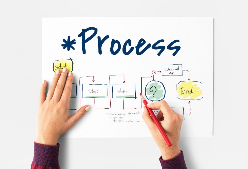
Crafting a Lasting Impression: Logo Design Process
The art of logo design is a journey that combines creativity, strategy, and meticulous craftsmanship. It is a process that involves translating a brand’s essence into a visual language, a language that resonates with audiences and leaves an indelible mark. As we delve into the heart of the logo design process, we unveil the intricate steps that transform ideas into iconic emblems.
There are a few simple steps to consider when designing a logo:
1. Research and Discovery: The journey begins with a deep dive into the brand’s identity, values, target audience, and industry landscape. This phase involves understanding the brand’s history, its unique selling points, and the emotions it aims to evoke. Researching competitors and identifying design trends provides a foundation for differentiation.
2. Conceptualization and Ideation: Armed with insights, the designer enters the realm of ideation. This phase is a whirlwind of creativity, where ideas flow freely. Sketches, mind maps, and mood boards are used to explore different visual directions. Concepts emerge, and initial designs take shape.
3. Refinement of Concepts: From the pool of ideas, select a few promising concepts for further development. Begin refining these concepts, experimenting with different shapes, colors, and typography. This phase involves seeking the balance between simplicity and complexity, ensuring that each design element serves a purpose.
4. Digitalization: Once the refined concepts are ready, transition to digital platforms. Using design software, transform hand-drawn sketches into digital renderings. Experiment with different typefaces, color palettes, and layout variations, fine-tuning every detail.
5. Feedback and Iteration: Share the digital concepts with stakeholders, clients, or focus groups. Gather feedback and insights, using them to refine and iterate on the designs. This phase is characterized by a continuous loop of revisions and improvements, honing the logo until it aligns perfectly with the brand’s vision.
6. Typography and Fine-Tuning: Typography plays a pivotal role in logo design. Select typefaces that complement the brand’s personality and message. Pay careful attention to kerning, leading, and letterforms, ensuring optimal legibility and aesthetic appeal.
7. Color Exploration: Colors evoke emotions and associations. Experiment with different color combinations to find hues that resonate with the brand and its target audience. Consider the psychology of color and the cultural implications of different shades. Up until this stage, it is advisable to design the logo in black and white and not in color. Designing a logo in its early stages in black and white gives a broader understanding of whether the logo conveys the desired message or not. With the help of the use of color, we can strengthen the message.
8. Simplicity and Adaptability: Embrace the power of simplicity while ensuring the logo remains versatile across various applications and platforms. Test the logo’s scalability, ensuring it retains its impact whether on a billboard or a mobile screen.
9. Finalization and Presentation: With feedback incorporated and all elements refined, finalize the logo design. Present the logo to the client or stakeholders, explaining the design choices and the rationale behind them. This is an opportunity to highlight the logo’s ability to embody the brand’s identity and messaging.
10. Delivery and Guidelines: Provide the client with the final logo files in various formats (vector, raster, etc.). Additionally, create brand guidelines that outline logo usage, color codes, typography, and clear space requirements. These guidelines ensure consistent and coherent application of the logo across different contexts.
The logo design process is a testament to the intricacies of visual storytelling. Each phase is a thread woven into a grand tapestry that captures the brand’s essence, values, and aspirations. Through this creative journey, designers breathe life into concepts, transforming them into emblems that resonate with audiences, stand the test of time, and forge lasting connections.
Crafting Lasting Brand Impressions: A Recap
Crafting a logo that transcends visual aesthetics and captures the essence of a brand is an art and science. The psychology of logo design weaves together colors, shapes, typography, and symbolism, tapping into the intricate threads of human perception and emotion. Through intentional design, a logo becomes a potent tool that leaves a lasting imprint, resonating with audiences across cultures and generations. So, whether it is the simple elegance of Apple’s apple or the vibrant red of Coca-Cola, every logo is a story waiting to be told—one that brands etch into the collective memory of society.
The synthesis of psychology, design principles, and brand identity culminates in a memorable logo that leaves an indelible mark. Logos become more than mere symbols; they embody the soul of a brand, forging connections that stand the test of time.
FAQs: Demystifying Logo Design
How do I choose the right colors for my logo?
Select colors that align with your brand’s personality and message. Consider the emotions and associations different colors evoke to resonate with your target audience.
Can a logo change consumer perception?
Absolutely. A well-crafted logo can evoke positive emotions and influence how consumers perceive and connect with a brand.
Is a complex logo better than a simple one?
Not necessarily. A simple logo is often more memorable and versatile, making it easier to recognize and reproduce across various platforms.
When should I consider updating my logo?
Logo updates are warranted when your brand’s focus, values, or target audience evolve. A refreshed logo can signal growth and modernity.
How do cultural considerations impact logo design?
Cultural sensitivity is crucial. Research cultural symbolism and associations to avoid unintended offense or misinterpretation.