- Related Categories: Branding, Graphic Design, Graphic Design Tips, Minimalist Design, Typography
Table of Contents

In a world overflowing with visual stimuli, where every inch of our digital and physical spaces clamor for attention, the art of minimalism in graphic design emerges as a powerful antidote. It is the subtle whisper amidst the cacophony, the masterful stroke that transforms simplicity into an indelible masterpiece.
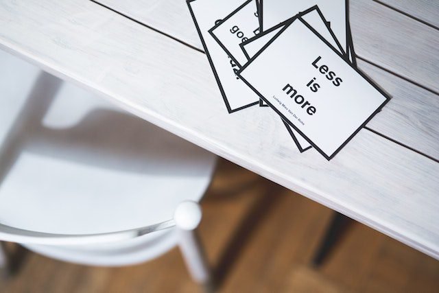
At its core, minimalism in graphic design is a philosophy that revels in the elegant dance of ‘less is more.’ It is the deliberate act of distillation, where each element plays a vital role, and every pixel, line, and stroke serves a purpose.
The Power of Simplicity
In a society defined by perpetual sensory overload and information flood, the power of simplicity in graphic design emerges as a beacon of clarity and impact. In this age of rapid consumption and fleeting attention spans, embracing minimalism is not merely an aesthetic choice; it is a strategic approach that commands attention and resonates deeply with audiences.

Sculpting Impact through Restraint: The concept of ‘less is more’ lies at the heart of the power of simplicity. It is the art of careful curation, where each design element serves a purpose, and every line and curve is meticulously placed. This deliberate restraint might seem paradoxical at first – how can something with fewer elements hold more significance? Yet, this paradox is precisely where the allure of minimalism lies.
Engaging the Viewer’s Imagination: Stripping away the superfluous, minimalist design invites viewers to engage with the content on a more profound level. The absence of clutter creates a canvas upon which the viewer’s imagination can flourish. It is a dance of anticipation and exploration, where the spaces between elements become as essential as the elements themselves. This interaction between the design and the viewer sparks curiosity and intrigue, leading to a more immersive experience.
Amplifying Communication: At its core, design is a form of communication. Minimalism ensures that this communication remains clear. Each element, each stroke of the brush, contributes to the conveyed message. In a minimalist composition, there is no room for ambiguity or confusion.
Fostering Timelessness and Universality: Minimalist design possesses an inherent timelessness that defies trends and fads. Its reliance on fundamental design principles, coupled with its simplicity, grants it a lasting appeal. This timelessness ensures that minimalist designs do not succumb to the passage of time – they remain relevant and resonant across eras.
Cultivating Emotional Impact: The power of simplicity is not limited to aesthetics; it extends to emotions. A minimalist design can evoke a range of emotions, from tranquility and introspection to amazement and wonder. By stripping away distractions, the design creates an emotional space, allowing viewers to connect with the underlying sentiment more intensely.
The power of simplicity in graphic design is a masterstroke in effective visual communication. It is the art of wielding restraint to amplify impact, the orchestration of design elements to foster deep engagement, and the cultivation of an aesthetic that transcends fleeting trends. Minimalism is not a reduction; it is an elevation, a testament to the adage that the most profound messages are often conveyed through the most elegant simplicity.
Key Principles of Minimalist Design
Minimalist design is an eloquent dance between artistic expression and purposeful restraint. It draws its strength from a set of guiding principles that converge to create compositions of remarkable clarity and resonance.

Clutter-Free Layouts: Focusing on Essential Elements
At the heart of minimalist design lies the concept of decluttering. It is about creating a visual narrative where each element is a deliberate storyteller, contributing to the overarching plot. By embracing a clutter-free approach, minimalist design allows for a direct and unobstructed dialogue with the viewer. The power of focus reigns supreme, and every element competes not for attention but for significance.
The process of creating clutter-free layouts is a meticulous endeavor. It involves a critical assessment of each design element’s role – is it essential to the narrative? This curation demands a discerning eye, one that can discern the extraneous from the indispensable. Through this, the designer achieves a harmonious equilibrium, orchestrating a symphony where each note is essential to the melody.
Whitespace: Using Space to Enhance Impact
The strategic use of whitespace, or negative space, is a hallmark of minimalist design. It transforms the canvas into a realm of visual equilibrium, where every element finds its breathing room. Whitespace is not an absence; it is a presence – a silent force that shapes the composition’s rhythm and pace. It enhances the impact of the design’s core elements, allowing them to resonate with greater intensity.
Whitespace offers a respite; It bestows a sense of clarity and elegance, elevating the viewer’s experience from one of sensory overload to one of focused contemplation. The spaces between elements are not voids to be filled; they are pathways that guide the viewer’s gaze, directing attention with purposeful intent.
Typography: Choosing Fonts Wisely
Typography in minimalist design is an exercise in subtlety and distinction. Fonts are used as communication tools, carrying the message of the design with precision. Clean and unadorned fonts, San-serif fonts, are preferred in the digital world thanks to the ability to read clearly on the screen. Additionally, their simplicity reflects the overall minimalist aesthetic.
The art of minimalist typography involves a delicate balance between readability, legibility, and aesthetics. Fonts are chosen not for their flamboyance, but for their ability to fit seamlessly into the narrative of the design. Their form echoes the ethos of minimalism – every curve and stroke is intentional, contributing to the overall resonance of the design.
Color Palette: Limited Hues for Maximum Effect
In the minimalist realm, the color palette becomes a symphony of restraint. Rather than a broad spectrum, a limited number of carefully chosen hues are employed. These colors work in harmony to evoke emotions, convey messages, and create visual cohesion.
Minimalist color palettes are not chosen arbitrarily; each hue is imbued with significance. The designer carefully selects colors that align with the design’s intended mood and impact. The resulting composition is a testament to the power of color restraint – an exquisite interplay of shades that heightens the design’s visual impact.
Less is More: Case Studies

Apple’s Iconic Minimalism: The Power of Singular Focus
Few companies have harnessed the power of minimalism as effectively as Apple. From their sleek product designs to their user interfaces, Apple’s commitment to simplicity has become a hallmark of their brand identity. Take, for instance, the iPhone – a device that transformed how we interact with technology. The minimalism in its design is not a mere aesthetic choice; it is a strategic decision that enhances user experience.
The iPhone’s user interface exemplifies the ‘less is more’ philosophy. Each app icon is a visual testament to the power of singular focus. No unnecessary embellishments distract from the core functionality. This minimalist approach ensures that users can navigate effortlessly, unburdened by visual noise. The impact is profound: The design does not scream for attention. It respectfully awaits interaction.
Apple’s minimalism extends beyond the digital realm. Their physical products – from the MacBook to the Apple Watch – embody a tangible elegance. The smooth curves, the absence of superfluous buttons, and the monochromatic color schemes – all contribute to a design that prioritizes user experience over ostentation.
Nike’s Swoosh: The Beauty of a Single, Memorable Symbol
The Nike Swoosh is a triumph of minimalistic graphic design. It is a single, elegantly curved line that encapsulates movement, energy, and aspiration. The power of the Swoosh lies not in its complexity, but in its simplicity. This minimalist symbol has transcended its origins as a mere logo; it has become a globally recognized emblem of sport, determination, and achievement.
The Nike Swoosh teaches us that impact does not necessitate intricacy. Minimalism can communicate volumes with a single stroke. The Swoosh design embodies the essence of Nike’s brand philosophy – the relentless pursuit of excellence. Its minimalism reflects the brand’s laser-focused commitment to empowering athletes and individuals to push beyond limits.
In both Apple and Nike, we witness the potency of minimalism. Their designs do not clamor for attention; they command it. By embracing simplicity, they elevate their products and messages to a level of resonance that transcends fleeting trends. These case studies stand as a testament to the timeless truth that in design, as in life, less can indeed be more.
Minimalist Design in Web and Print
Web Design: Navigating with Ease
Minimalist design finds its true calling in the digital realm, where the battle for attention is fierce, and user experience is paramount. Websites that embrace minimalism offer users a sanctuary of clarity amidst the chaos of the online landscape. Google, a prime example, employs minimalist principles to create an interface that guides users seamlessly.
Upon visiting Google’s homepage, users are welcomed by a large space with an empty white background and a solitary search bar. This intentional simplicity speaks volumes. Users are free from visual clutter, and their attention is directed towards the task at hand – searching. Navigation is straightforward and devoid of distractions. Every element serves a purpose, reinforcing the notion that minimalist web design is about reducing friction and enhancing usability.
Minimalist web design is not merely about aesthetics; it is about purpose-driven functionality. By stripping away non-essential elements, designers ensure that users engage with content in a way that is intuitive and natural. The result? A harmonious dance between user and interface, where each click is intentional, and each interaction is seamless.
Print Design: Making Every Element Count
In the realm of print, minimalist design transforms the tactile experience. Consider ‘The New Yorker,’ a magazine renowned for its editorial excellence and minimalist aesthetic. Each page layout is a testament to the power of purposeful design. Whitespace is used with precision, framing articles and images in a way that beckons readers to explore.
Minimalist print design is about making every element count. Each image, each caption, and each block of text is an integral part of the composition. The journey of the reader is thoughtfully curated, directing their focus and attention. The absence of visual clutter allows the reader to engage more deeply with the content, fostering a sense of immersion and connection.
In both web and print, minimalist design transcends aesthetics; it is a language of communication and experience. Minimalist web design creates digital landscapes where users can navigate effortlessly, while minimalist print design transforms pages into canvases of clarity. These two realms converge in their pursuit of a singular goal – to elevate the user’s encounter with design, whether on screen or on paper.
The Emotional Impact of Minimalism
The minimalist design stands out as a calming melody in the chaotic symphony of the modern world, offering a haven of peace and reflection. Beyond only being appealing, minimalism has a unique ability to arouse a variety of emotions and create a strong bond with the spectator.

Creating a Sense of Calm and Focus
Minimalist design’s serene aesthetic is an antidote to the sensory overload that characterizes contemporary life. The uncluttered spaces and clean lines create an oasis of calm within the digital or physical realm. This serenity has a direct impact on the viewer, inviting them to slow down and engage in a moment of respite.
Imagine a website with ample whitespace, carefully chosen typography and a limited color palette. As a user navigates through this space, there is an unmistakable sense of clarity. The absence of visual noise allows the user’s mind to rest, facilitating a focused and immersive experience. In a world of rapid scrolling and constant notifications, this sense of calm becomes a rare and precious gift.
Provoking Thought and Reflection
Minimalist design is more than a visual style; it is an invitation to delve deeper. By paring down design elements to their essentials, minimalism creates a canvas upon which viewers can project their thoughts and interpretations. The design’s simplicity acts as a springboard for contemplation, encouraging viewers to explore beyond the surface.
Consider a poster with a single, striking image and a few carefully chosen words. The viewer is compelled to engage in an active dialogue with the design – to unearth the layers of meaning beneath the surface. Minimalism provokes curiosity, inviting viewers to complete the narrative, and fostering a sense of co-creation between the designer and audience.
Minimalism Beyond Aesthetics
Minimalism’s influence extends far beyond its visual appeal, touching upon realms that resonate deeply with our values and aspirations. Beyond its role as an aesthetic choice, minimalism becomes a philosophy that intersects with sustainability, user experience, and the very essence of design’s purpose.
Sustainability and Minimalist Design: Less Waste, More Impact
At its core, minimalism is a celebration of essentials. This ethos aligns harmoniously with the principles of sustainability. In a world grappling with environmental challenges, minimalist design advocates for conscious consumption. By focusing on the essentials and eliminating unnecessary elements, minimalism reduces waste – both in terms of resources used in production and the cognitive overload experienced by the audience.
Consider packaging design. A minimalist approach champions functionality over excess. Unnecessary layers and embellishments are stripped away, leaving behind a design that serves its purpose with elegance. This reduction not only conserves resources but also communicates a brand’s commitment to a greener future.
Minimalist design inspires us to embrace quality over quantity, and durability over disposability. It challenges us to reassess our relationship with material possessions and encourages a shift toward thoughtfulness and intentionality. In this sense, minimalism becomes a beacon guiding us towards a more sustainable path.
Minimalist User Interface (UI) and User Experience (UX) Design
Minimalism seamlessly finds its place in the digital realm, particularly in user interface and experience design. A minimalist UI/UX approach prioritizes clarity and functionality, delivering an experience that is intuitive, efficient, and gratifying.
In user interface design, the ‘less is more’ principle ensures that users are not overwhelmed by a barrage of options. A clean interface guides users toward their desired actions without confusion. Similarly, in user experience design, a minimalist approach enhances navigation and reduces friction, leading to a seamless journey through digital landscapes.
Consider a mobile app with a minimalist interface. Each button, each element, is placed with precision. This intentional design eliminates clutter, making it easier for users to accomplish tasks. The minimalist design also streamlines the user’s cognitive load, allowing them to interact with the app effortlessly. In this way, minimalist UI/UX design becomes a conduit for enhanced digital experiences.
Embracing Minimalism: Practical Tips
Minimalism is more than a design style; it is a mindset that challenges us to distill our creative efforts to their essence. Following these helpful suggestions will enable you to embrace minimalism and produce designs that resonate with clarity and purpose.

Starting with a Clear Concept
Begin with a clear and well-defined concept. Understand the core message you want to convey, the emotions you aim to evoke, and the essence of your design’s narrative. This conceptual clarity serves as your North Star, guiding your design decisions with purpose.
Imagine you are designing a poster for a cultural event. Start by identifying the event’s central theme and the emotions it intends to evoke. Is it about celebration, introspection, or discovery? Once you have a clear concept, every design element you add should contribute to amplifying this concept, ensuring a cohesive and impactful composition.
Iterative Design Process: Less Until More
Embrace an iterative design process that embodies the ‘less until more’ philosophy. Begin with the essentials – the elements that are crucial to your design’s message. As you add elements, continuously question their necessity. Does each addition enhance the design’s impact, or does it introduce unnecessary noise?
Imagine you are designing a website for a photography portfolio. Start with a simple layout that highlights the photographs or elements themselves. Slowly add elements like navigation menus and captions, ensuring each addition serves to enhance the user’s experience. This iterative approach allows you to fine-tune your design, ensuring that every element earns its place.
Testing and Feedback: Refining with Precision
Gathering feedback is a crucial step in perfecting minimalist designs. Share your work with peers, mentors, or target audiences to gain fresh perspectives. Listen attentively to their insights, paying attention to how they perceive the design’s message and emotional impact.
Imagine you are designing a book cover. Present your minimalist design to a focus group and observe their reactions. Do they immediately grasp the book’s genre and mood? Do they connect emotionally with the design? Constructive feedback helps you refine your design with precision, ensuring that every element aligns with your intended impact.
Balancing Minimalism and Functionality
Minimalist design does not mean sacrificing functionality. While you strive for simplicity, ensure that your design effectively serves its purpose. For example, in web design, prioritize intuitive navigation and user-friendly interfaces, even as you embrace minimalism.
Imagine you are designing a mobile app for a task management tool. Keep the interface uncluttered, with clear buttons and a straightforward layout. However, ensure that users can easily access essential features and information without confusion. Minimalism and functionality can coexist harmoniously, enhancing the user experience.
Conclusion: Elevating Design through Minimalism
Minimalism and simplicity in graphic design is a language that whispers rather than shouts, a symphony that resonates with clarity. From decluttered layouts to purposeful typography and restrained color palettes. minimalism is the brushstroke that paints emotion and meaning onto the canvas of design.
As we traverse the landscape of design, let us be guided by the wisdom of minimalism – a philosophy that teaches us to distill, refine, and elevate. Minimalism invites us to embrace the challenge of doing more with less, of conveying depth through simplicity. It reminds us that true mastery lies not in excess but in the precision of restraint. By embracing minimalism, we embark on a journey of purposeful creation, crafting designs that transcend trends and resonate with timeless elegance.
FAQ
1. Is minimalism suitable for all types of design?
Minimalism can be applied to various design genres, from graphic and web design to architecture and fashion. It is a versatile philosophy that emphasizes clarity and purpose.
2. How does minimalism affect user experience?
Minimalist design often leads to improved user experiences. By eliminating distractions, users can navigate interfaces more easily, leading to enhanced engagement and satisfaction.
3. Can minimalist design be colorful?
Absolutely. While minimalist design often employs limited color palettes, color is not off-limits. Each hue is chosen purposefully to evoke specific emotions and create a harmonious visual experience.
4. How can I incorporate minimalism into my design process?
Start by defining your core message and objectives. Then, adopt an iterative design process, adding elements only when they enhance the overall design. Do not hesitate to seek feedback to refine your minimalist approach.
5. What’s the difference between minimalism and simplicity in design?
While both minimalism and simplicity prioritize clarity, minimalism goes a step further by deliberately removing elements that do not contribute to the core message. It is about distilling design to its essence.


