- Related Categories: How To, Web Design & Development, Web Design Tips, Web Design Tools
Table of Contents

In today’s digital landscape, the call-to-action (CTA) button plays a crucial role in guiding user behavior and driving conversions. A well-designed CTA button can significantly boost user engagement and improve the overall effectiveness of a website. This is where Elementor, a popular WordPress page builder, comes in handy, offering powerful tools to create visually appealing and high-performing CTA buttons.
This guide will walk you through the process of designing an effective CTA button using Elementor. It will cover the key elements of CTA design, including button styling, accessibility considerations, and best practices for CTA web design. The article will also delve into setting up the Elementor workspace, crafting the button’s appearance, and optimizing its performance through testing.
Understanding CTA Buttons and Their Importance

Definition of CTA buttons
A call-to-action (CTA) is a crucial element on a website that prompts users to take a specific action. These elements serve as signposts, guiding visitors toward desired outcomes such as signing up for a newsletter, downloading a demo, or purchasing. CTAs can appear in various forms, including clickable buttons, hyperlinked text, or even as part of digital marketing ads.
The primary purpose of a CTA is to make the next step clear to potential customers. By providing a clear directive, businesses increase the likelihood of users progressing through the sales funnel and ultimately converting. CTAs are not limited to a single appearance on a webpage; multiple CTAs can be strategically placed to encourage various desired actions.
Why CTA buttons are crucial for conversions
CTA buttons play a vital role in the success of a webpage and, by extension, the entire sales funnel. Here’s why they are so important:
- Increased user engagement: CTAs encourage users to interact more with a website. For instance, a well-placed CTA at the end of a blog post can direct readers to explore related content or share their thoughts in the comments section. This increased engagement helps familiarize users with the brand, building trust and opening doors for future conversions.
- Lead generation: CTAs are excellent tools for collecting contact information from visitors who may not be ready to make an immediate purchase but could be interested in future interactions. Businesses can follow up with potential customers later by prompting users to leave their email addresses or phone numbers.
- Improved conversion rates: Effective CTAs can significantly boost conversion rates. Studies have shown that personalized CTAs convert 202% better than basic CTAs. This is because personalized CTAs align with the user’s buyer’s journey and resonate with their specific interests.
- Clear communication: A well-crafted CTA communicates what users can expect when they take the next action. This clarity can lead to improved click-through rates and ultimately, more conversions.
- Guiding user behavior: CTAs act as a final push or “rite of passage” for generating qualified leads and sales. Without high-quality CTAs, businesses risk experiencing little to no inquiries, making them one of the most beneficial elements in a marketing pipeline.
It’s important to note that the effectiveness of CTAs can vary. While some businesses may see exceptional results, others may experience more modest outcomes. For instance, in email marketing, CTAs have been found to achieve an average click-through rate of 3-5% for over 40% of marketers.
To maximize the impact of CTAs, businesses should consider the following strategies:
- Personalization: Tailoring CTAs to specific target audiences can increase conversions by up to 42% compared to generic CTAs.
- Strategic placement: While it’s common to place CTAs above the fold, having multiple CTAs throughout a page can be beneficial. This approach acknowledges that users may need more information before taking action.
- Design elements: The style and design of CTAs matter. Button-shaped CTAs have been shown to generate 45% more clicks than simple hyperlinks. Additionally, including visual elements like arrows can increase clicks by 26%.
- Simplicity and focus: Removing distractions and unnecessary elements around the CTA can create a sense of clarity and focus, potentially increasing conversions.
By understanding the importance of CTAs and implementing these strategies, businesses can significantly improve their conversion rates and guide more users toward desired actions.
Key Elements of an Effective CTA Button
Button Text
The text on a call-to-action (CTA) button plays a crucial role in its effectiveness. It should be action-oriented, using command verbs that incite users and readers to take action. For instance, words like “buy,” “download,” “get,” or “call” provide clear directions to the user. The text should also be consistent with the web page where it’s located. For example, a software website’s main page might have a “Learn More” CTA, while specific product pages could use “Request a Demo.”
To make the CTA more compelling, it’s important to create a sense of urgency or enthusiasm. Using phrases that create urgency, such as “now” or “today,” can encourage immediate action. Additionally, highlighting the benefits of clicking the button can be effective. For instance, offering a free resource like an eBook or a service estimate can provide an incentive for users to click.
Color and Contrast
The color of a CTA button is a highly debated topic in the realm of conversion optimization. While some argue that certain colors like red, green, or orange perform best, the reality is more nuanced. The effectiveness of a button color depends largely on its contrast with the surrounding design elements.
Contrast is key in making a CTA button stand out. There are two forms of color contrast to consider:
- Contrast between the button color and the background
- Contrast between the button text and button color
To achieve maximum contrast, designers often use complementary colors (opposite on the color wheel) or triadic colors (a third of the way around the color wheel). However, it’s crucial to maintain consistency with the brand’s color palette.
Size and Shape
The size and shape of a CTA button can significantly impact its effectiveness. The button should be large enough to attract attention but not so large that it overwhelms the page layout. It’s important to strike a balance between making the button noticeable and maintaining overall design harmony.
As for shape, rounded corners are often preferred. Studies have shown that people are generally unfavorable to sharp edges, as they can subconsciously indicate a threat. Rounded shapes also take less cognitive effort to process, making them more appealing to users.
Placement on the Page
The placement of a CTA button on a page can greatly affect its visibility and accessibility. A common practice is to position the CTA button above the fold, meaning it’s immediately visible without scrolling. According to a recent study, “Where to place CTAs for an 83% increase in blog revenue,” this placement can increase a blog post’s revenue by up to 83%.
However, the ideal placement can vary depending on the page content and user behavior. For longer pages, it may be beneficial to duplicate the CTA, placing one in the middle and one at the end of the page. This strategy ensures that the CTA is always within reach as the user scrolls through the content.
It’s also crucial to give the CTA button enough space to “breathe.” Creating negative space (or white space) around the button helps make it more visible and attractive, reduces clutter and distraction, and improves readability and usability.
By carefully considering these key elements – button text, color and contrast, size and shape, and placement – designers can create CTA buttons that are not only visually appealing but also highly effective in driving user engagement and conversions.
Setting Up Your Elementor Workspace
Accessing and Understanding the Elementor Editor
To begin designing an effective CTA button in Elementor, you first need to access the Elementor editor. This process starts by navigating to the WordPress dashboard and clicking on “Pages,” followed by “Add New” or clicking “Edit with Elementor” on the desired page. Once you created the new page, you should click “Edit with Elementor” to enter the page builder interface.

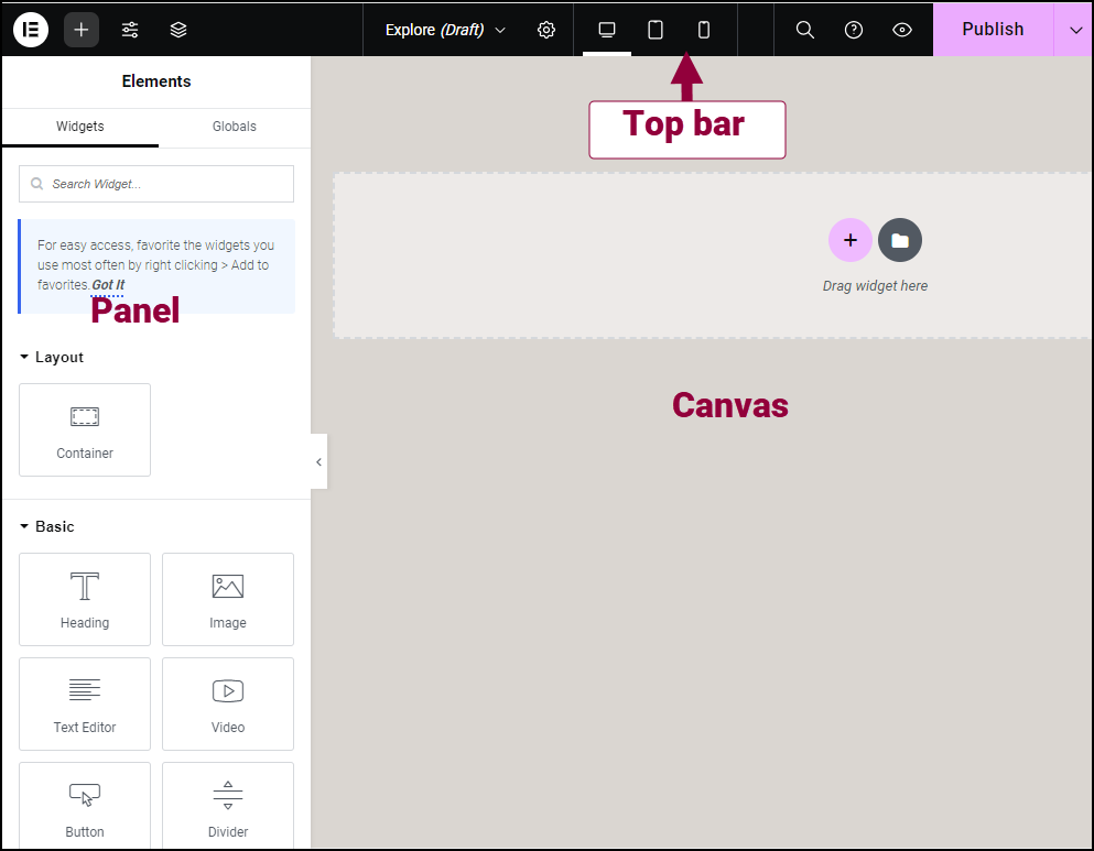
Upon entering the Elementor editor, you will see the main workspace divided into two primary areas: the panel on the left side and the canvas (also known as the Content Area) on the right. The panel houses all the drag-and-drop features and widgets that can be used to build the web page, while the canvas is where the actual page creation takes place.
To maximize the available space for design work, you can click the Hide Panel arrow to increase the canvas width. This feature is particularly useful when working on detailed elements like CTA buttons, as it provides a clearer view of the design in progress.
Choosing a template or starting from scratch
When setting up the Elementor workspace, you have the option to either start with a blank canvas or use one of Elementor’s pre-designed templates. For those opting to start from scratch, the process begins by adding a new section to the page.
To add a new section:
- Click the “+” icon on the canvas.
- Select a container layout. The first option creates a single container with a vertical layout.
Once a container is added, you can start customizing it to fit their needs. To edit a container:
- Click the settings icon in the container tab.
- The container settings menu will open in the panel, offering three tabs: Layout, Style, and Advanced.
These settings allow you to adjust the container’s dimensions, background, and other properties to create the perfect foundation for the CTA button. For more details on how to use Elementor, check the following guide.
For those who prefer to use a template, Elementor offers a wide range of pre-designed layouts that can be customized to suit specific needs. These templates can serve as a starting point, saving time and providing inspiration for the overall page design.
Adding and Customizing Widgets
Regardless of the chosen starting point, the next step involves adding and customizing widgets. The Call to Action (CTA) widget is particularly useful for creating attractive boxes that encourage website visitors to take specific actions. To add the CTA widget:
- Click the “+” icon in the Elementor editor.
- Search for “Call to Action” in the widget list.
- Drag and drop the widget onto the desired location on the canvas.
Once added, you can customize the CTA widget through its Content, Style, and Advanced tabs. These settings allow for the adjustment of elements such as the button text, link, image, and overall design to create a compelling and effective CTA button.
By following these steps, you can set up their Elementor workspace and begin the process of designing an effective CTA button that aligns with their website’s goals and esthetic.
Designing Your CTA Button in Elementor
Selecting the Button Widget
To begin designing an effective CTA button in Elementor, you should first locate and select the Call to Action (CTA) widget. This widget is specifically designed to create attractive boxes that encourage website visitors to take specific actions, such as signing up for a newsletter, making a purchase, or contacting the business.
To add the CTA widget to the page:
- Click the “+” icon in the Elementor editor.
- Search for “Call to Action” in the widget list.
- Drag and drop the widget onto the desired location on the canvas.
The CTA widget offers two skin options: Classic and Cover. The Classic skin allows you to position the image relative to the content (left, above, or right), while the Cover skin places the image as a background.
Customizing Button Text and Link
Once the CTA widget is in place, you can customize the button text and link to create a compelling call-to-action. Here’s how to do it:
- In the Content tab, locate the Button Text field and enter the desired text for the button.
- In the Link field, input the URL for the button’s destination.
- Click the Link Options cog to add rel=nofollow to the link or to open the link in a new window, if desired.
- In the Apply Link On field, choose whether to apply the link to the Whole Box or Button Only.
To further enhance the button’s appearance and functionality, you can customize various elements:
- Typography: Adjust the font, size, and style of the button text.
- Colors: Set the text color, background color, and border color for both normal and hover states.
- Border: Configure the border width and radius to achieve the desired shape.
- Hover Effects: Apply animations, such as zoom-in, to engage users when they hover over the button.
- Transition Duration: Set the speed of hover effects, measured in milliseconds (e.g., 1500 ms for a 1.5-second transition).
To create eye-catching visuals, you can combine images, content, and buttons within the CTA widget. Additionally, they can apply CSS filters, color layers, and other styles to enhance the overall design.
For those seeking pixel-perfect CTAs, Elementor provides control over every detail, including height, width, spacing, and typography. This level of customization ensures that the CTA button aligns perfectly with the website’s design and goals.
To maximize the effectiveness of the CTA button, it’s important to consider its purpose and placement on the page. CTA buttons should serve one of four main purposes: education, guidance, support, or conversion. They should be strategically placed throughout the website, including at the end of forms and on every page, to guide visitors toward taking desired actions.
By following these steps and utilizing Elementor’s robust customization options, you can create compelling and effective CTA buttons that drive user engagement and conversions on their websites.
Styling Your CTA Button for Maximum Impact

Adjusting colors and typography
When designing a CTA button, color plays a crucial role in optimizing clicks and conversions. However, it’s not as simple as choosing between red or green. Several factors need consideration:
- Branding
- Color harmony
- Color contrast
A well-designed CTA button should contrast with its surroundings while still complementing the site’s branded elements. For instance, Chewy’s “Add to Cart” button exemplifies effective color contrast within the brand’s esthetic.
Typography is equally important for CTA buttons. To ensure quick readability and user confidence, stick to plain-looking serifs and sans serifs with distinctive characters. The color of the button text should contrast with its background for clear legibility. To verify color combinations, it’s advisable to use a color contrast checker.
Optimizing size and padding
The size of a CTA button plays a crucial role in its effectiveness. While it should be eye-catching, an excessively large button can appear obnoxious or demanding. To strike the right balance, consider the hierarchy of size on the page. For example, the Netflix landing page naturally draws visitors’ attention to larger text elements first, as larger text signifies greater importance.
Padding is another critical aspect of CTA button design. It gives important elements room to breathe, helping visitors focus on them more easily. Proper spacing can improve both legibility and clickability. When setting padding, a good rule of thumb is to make it 0.5x the button’s height for optimal proportions.
To fine-tune the padding, designers can use Elementor’s customization options. For instance, setting padding to 15 pixels all around creates a nice button appearance. Alternatively, designers can adjust top and bottom padding separately from left and right padding for more precise control.
Adding hover effects
Hover effects can significantly enhance user engagement and interaction with CTA buttons. These effects provide instant confirmation that the button is interactive, adding a small element of surprise for visitors.
To create an effective hover state:
- Click on the button in the Elementor canvas to select it.
- Go to the “Style” tab in the left panel to customize the button’s appearance.
- Under the “Style” tab, you will find options for “Normal” and “Hover” states.
- Normal State: Customize the default appearance of the button.
- Hover State: Customize the button’s appearance when a user hovers over it.
- Select the “Hover” tab within the “Style” section to start setting hover effects.
- Background Color: Choose a different color that will appear when the user hovers over the button.
- Text Color: Set a different text color for the hover state.
- Border: Adjust the border color, width, and radius for the hover effect.
- Box Shadow: Add or modify a shadow that appears on hover for a more pronounced effect.
By carefully considering these aspects of CTA button design – color, typography, size, padding, and hover effects – designers can create buttons that not only look appealing but also effectively guide users toward desired actions on the website.
Testing and Optimizing Your CTA Button
A/B Testing Different Designs
A/B testing is a powerful method to optimize CTA buttons and improve website performance. This process involves showing two different versions of a page to visitors to determine which one performs better. To conduct an effective A/B test, follow these steps:
- Create a hypothesis based on analytics and heat mapping tools like Google Analytics and Hotjar.
- Choose one element to test, such as color, font type, size, icon presence, border, button size, placement, hover state design, or copy.
- Ensure the CTA button is in an easy-to-edit format for flexibility in testing variations.
- Set up and run the A/B test using appropriate tools.
- Monitor results and update the button based on the data collected.
For more details regarding those steps, please check the next article by Elementor.
Analyzing Click-Through Rates
Click-through rate (CTR) is a crucial metric for measuring CTA button effectiveness. It represents the percentage of visitors who click on the button out of the total number of visitors who see it. To analyze CTR and other performance metrics:
- Use analytics tools to track views, clicks, and submissions over a specific time range.
- Calculate the click rate by dividing the number of clicks by the number of views.
- Monitor the submission rate for CTAs using form modules.
- Examine the total clicks over views report to understand performance trends over time.
For more details regarding those steps, please check the next article by Hubspot.
Making Data-Driven Improvements
Based on the insights gained from A/B testing and CTR analysis, make data-driven improvements to optimize your CTA button:
- Refine button design elements such as text color, background color, border color, width, and radius.
- Adjust button padding to determine the optimal size.
- Experiment with different copy variations to find the most compelling text.
- Test various value propositions to see which converts better.
- Consider using tools like Facebook Ads to build specific audiences for testing if working with a low budget.
By consistently testing, analyzing, and improving your CTA buttons, you can enhance user engagement and drive better conversion rates on your website. Remember to focus on one element at a time and make decisions based on the data collected from your tests.
Conclusion
Designing an effective CTA button in Elementor has a significant impact on user engagement and conversions. By carefully considering elements such as button text, color, size, and placement, website owners can create CTAs that not only catch the eye but also drive action. The process of crafting the perfect CTA involves thoughtful planning, creative design, and ongoing optimization through testing and analysis.
To wrap up, the key to success lies in understanding your audience and aligning your CTA design with their needs and preferences. By leveraging Elementor’s powerful features and following best practices, you can create CTAs that resonate with your visitors and boost your website’s performance. To dive deeper into Elementor’s capabilities or to start building your own eye-catching CTAs, check out Elementor today. Remember, the journey to create the ideal CTA is ongoing, requiring continuous testing and refinement to achieve the best results.
FAQs
How can I effectively design a CTA button?
To design an effective CTA button, follow these ten best practices: Choose an eye-catching color, ensure the button has ample space around it, use action-oriented text, include a compelling value proposition, create a sense of urgency, strategically place the button, apply special effects wisely, and limit the number of competing options.
What is the recommended size for a CTA button?
CTA buttons should be large enough for easy interaction, especially on mobile devices. According to the Web Content Accessibility Guidelines (WCAG), buttons should be at least 44 pixels in both width and height. Google recommends a slightly larger size of 48 pixels.
What design elements are crucial when creating a call-to-action button?
When designing a CTA button, it’s essential to consider several elements beyond the button itself. These include the background color, the images around the button, and the text that accompanies it to enhance overall effectiveness.
What is the ideal font for call-to-action buttons?
For call-to-action buttons, it’s best to use sans serif fonts as they are clear and easy to read. Choose a text color that contrasts well with the button color—dark text on light backgrounds and vice versa. Avoid script fonts, as they can be difficult to read quickly.


